Snow's Map Redesign
Controls
WASD - Move
Context
I was given the task of redesigning a notable piece of information graphics for data visualization. I decided that I would want to make it in Unity as I am one of the only game devs in the class, and I thought that making it a more gamified experience would be an interesting twist.
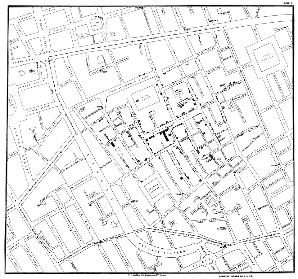
John Snow created a map in 1854, which was crucial in showing that cholera is not a miasma(through bad air), but spreads through water sources.
Process
Initially, I thought of making it fully 2d but with WASD movement, the map felt lifeless and boring. After asking the professor and others for review, I decided to tilt the map to make it easier for the player to feel like they are going about the streets.
I planned for 3 main features
- A counter that shows the number of nearby cases
- The ability to toggle the radius of scanning
- The ability to jump to the nearest pump.
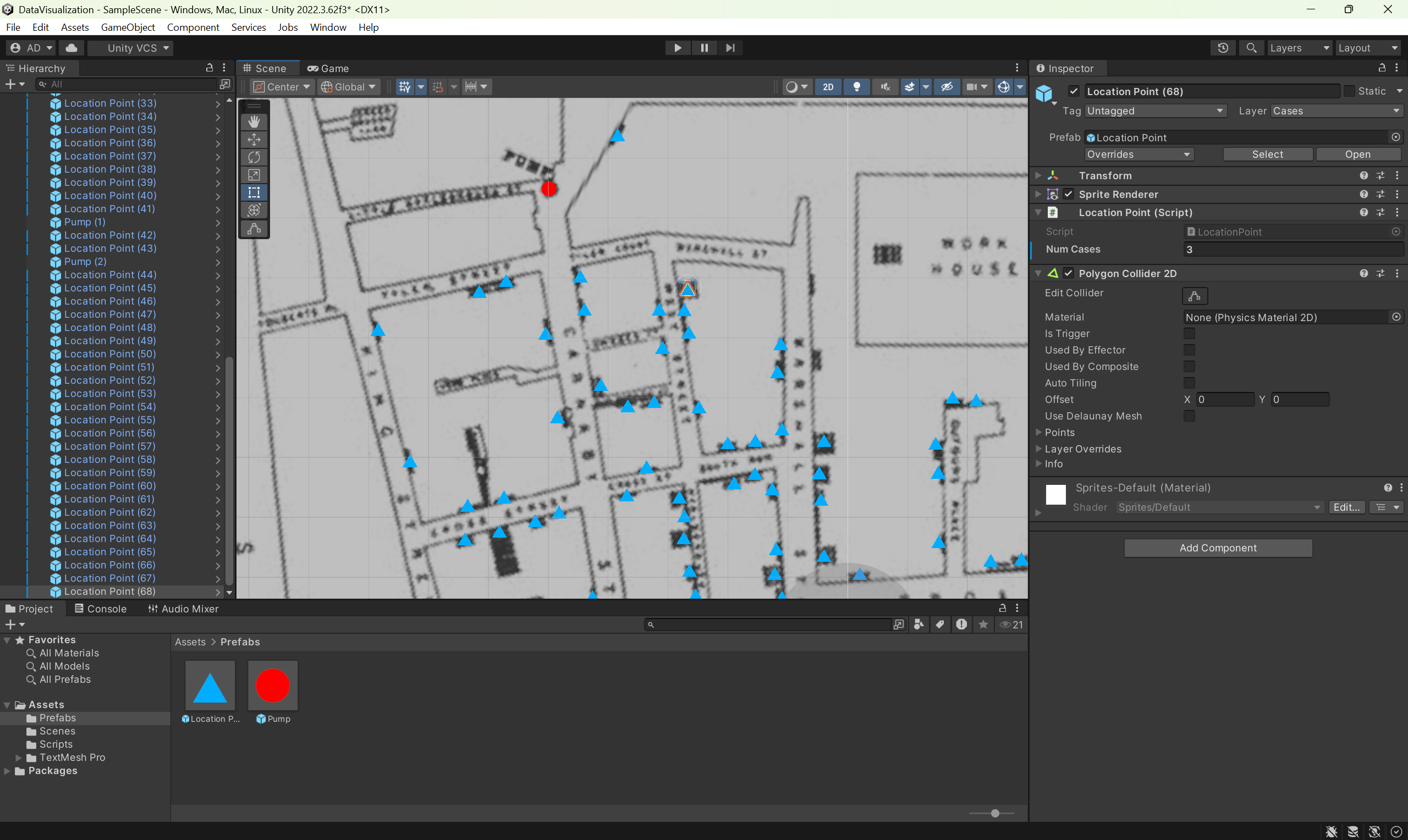
I physically plotted each poin on the map, partially as I wanted to see how it would feel to have to draw each of those individual lines (it was very tedious) .
This then led to many questions about my design. Should I hide the visualizations and only leave the UI? What colours should each point be? What colour should the pumps be? What should the iconography be?
I decided to change the location icons to squares as they felt better to look at visually.
Future Plans
I thought about adding more features, but due to the time, I was unable to. If I had to iterate on my current version of my visualization, I would
- Let the player jump between each pump in the area
- Remake the map in the scene
- Add a 3D visualization overlay
Purpose of this Visualization
I decided I wanted to make this as a media for persons who may have never even known this map existed. I mentioned that a random, simple visualization was intriguing enough to stay with me for over a decade. This is also why I put it on Itch.io. People may encounter it and decide to just see what it is. This may open them up to learning more about this topic.
Comments
Log in with itch.io to leave a comment.
This is a pretty cool way to present what that map portrayed. It may not be feasible to implement, given your limited time and scope for the project, but it might be cool to draw districts around each pump, with borders indicating which areas are most likely to depend on it as their primary water source. I’d imagine it’d look something like Vornoy noise, with districts containing a contaminated water supply being filled with cases, while those that don’t are rather sparse.
tldr: Cool Map 🤩